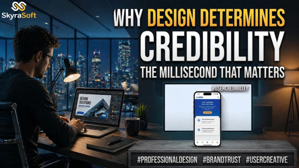
The Millisecond That Matters
In the digital age, your website is often your customer’s first interaction with your brand. That first impression takes milliseconds to form – research suggests 50 milliseconds is sufficient for users to form aesthetic judgments – and design determines whether that impression is positive or negative. Once formed, first impressions are remarkably persistent. Users who judge a site as unattractive in the first instant will rate subsequent interactions more negatively, even if the content is excellent.
The stakes could not be higher. A negative first impression sends potential customers back to search results, where they will find your competitors. A positive first impression opens the door to engagement, exploration, and eventual conversion. In a world where attention is scarce and options are abundant, design quality is the gatekeeper of customer acquisition.
Consistent design across all channels increases brand recognition by 80%. Consistent brands generate 3.5 times more brand visibility and enjoy 60% more repeat purchases. These statistics are not coincidental. They reflect the fundamental psychology of trust: we trust what we recognize, and we recognize what is consistent.
Professional design communicates competence, trustworthiness, and attention to detail before a single word is read. Your competitors are investing in design. The question is whether you will match their investment or surpass it. Professional graphic design is not an expense. It is the foundation of every successful customer interaction.
The Components of Credible Design
Credibility in digital design rests on several specific elements. Missing any of these creates doubt. Mastering all of them builds trust.
Typography is often overlooked but always noticed. Inconsistent font choices, inappropriate font sizes, poor line spacing, and insufficient contrast all signal amateurism. Professional typography is invisible – users don’t notice it because it doesn’t get in the way. But they notice when it’s wrong. A consistent typographic system with clear hierarchy (headings, subheadings, body text) guides readers through content effortlessly.
Color psychology operates below conscious awareness but powerfully influences perception. Blue suggests trust and stability. Green suggests growth and health. Yellow suggests optimism and caution. Black suggests luxury and sophistication. These associations are culturally learned but universally recognized within a given market. Professional designers select color palettes that align with brand personality and apply them consistently across all materials.
Spatial organization – layout, spacing, alignment – signals professionalism through precision. Elements that are misaligned, crowded, or awkwardly spaced suggest carelessness. Generous whitespace suggests confidence and clarity. Grid-based layouts create order that users perceive as trustworthy even if they cannot articulate why.
Imagery quality dramatically impacts credibility. Blurry, poorly lit, or obviously stock photos undermine trust. High-quality original photography, professional illustrations, or carefully selected premium stock imagery signals investment in quality. For product businesses, image quality directly impacts purchase intent – customers assume product quality correlates with image quality.
Mobile Design as Credibility Signal
With over half of web traffic originating on mobile devices, mobile design quality is no longer optional. A site that looks professional on desktop but breaks on mobile signals that the business hasn’t kept pace with how customers actually behave.
Responsive design – layouts that adapt to screen size – is the minimum standard. But true mobile credibility requires more. Touch targets must be large enough for fingers. Text must be readable without zooming. Forms must use appropriate input types. Navigation must be thumb-friendly. Pages must load quickly on mobile connections.
Mobile-first design, where the mobile experience is designed before the desktop experience, produces better results than responsive design bolted onto a desktop layout. Mobile-first forces prioritization: what matters most appears first. This clarity benefits all users, but it is essential for mobile credibility.
The consequences of poor mobile design are severe. Google penalizes non-mobile-friendly sites in search rankings, reducing visibility. Mobile users who encounter a broken or difficult site bounce at high rates. And those bounces are permanent – users rarely return to a site that failed them once. In mobile design, the first impression is often the only impression.
Design Consistency Across Touchpoints
A credible brand looks like itself everywhere. Your website, social media profiles, email communications, digital ads, invoices, and any other customer touchpoint should share visual DNA. Inconsistency across touchpoints creates confusion and erodes trust.
Website to social media consistency is particularly important. Customers who discover your brand on Instagram and then visit your website expect visual continuity. If colors, fonts, logo usage, or overall aesthetic shift dramatically, they may wonder if they’ve reached the correct account. This doubt, however momentary, reduces trust.
Email to website consistency affects conversion. Email campaigns that use different visual language than the landing page they link to create cognitive dissonance. The user who clicks expects a seamless transition. When the landing page looks like a different company, conversion rates drop.
Print to digital consistency matters for businesses with physical presence. Your business card, brochure, invoice, and packaging should visually align with your website. Every touchpoint reinforces brand recognition. Every inconsistency forces the customer to re-establish trust.
Creating consistency requires a brand style guide – a document specifying logo usage, color codes (hex, RGB, CMYK), typography (fonts, sizes, weights), spacing rules, imagery style, and any other visual standards. The style guide enables anyone creating customer-facing materials to produce consistent output. Without it, consistency is accidental rather than intentional.
The Competitive Imperative of Professional Design
Your competitors are investing in design. Not because they have extra budget, but because they have recognized that design quality directly impacts customer acquisition and retention. In competitive markets, design is often the differentiator that tips the balance between two otherwise similar offerings.
The barriers to professional design have fallen dramatically. Tools like Figma, Canva, and Adobe Express make design accessible to non-designers. Stock photography, icon libraries, and font services provide high-quality assets at low cost. Freelance designers on platforms like Upwork and 99designs offer professional services at accessible rates. The excuse that “design is too expensive” no longer holds.
The cost of poor design, however, remains high. Every visitor who bounces due to unprofessional appearance is a potential customer lost to a better-designed competitor. Every prospect who questions your credibility based on visual presentation requires additional effort to convert. Every existing customer who feels uncertainty about your brand based on inconsistent touchpoints is less likely to refer others.
First impressions are digital, and design determines credibility. The businesses that understand this invest accordingly. They treat design not as a cost to minimize but as a capability to develop. They measure design impact on conversion, retention, and referrals. And they capture the trust that professionally designed brands earn. In the digital-first economy, design credibility is not optional. It is the price of entry.